Thursday, August 07, 2014
Dream Interpretation, continued
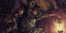
(...Redrawn somewhat from the last post. May not have improved significantly, but at least the shape consistency, anatomical correctness of (admittedly cartoon) faces, and line rhythm - so far as I can tell - seem decent enough when viewed in thumbnail format, nothing too jarring, though nothing overly dynamic in the Cyril Pedrosa sense. Found also that falling back on the usual M.O. of using a light blue/violet for secondary light source - or shading other than the core shadow - helped negate some of the more awkward shape solutions when it came to color. Again, so far as I can tell.
Primary rule of redrawing, which I didn't necessarily follow here: Start from scratch. Just like most anything in life, trying to rig something workable from a bad start or weak structure isn't going to have the same sort of pay off as opposed to hitting it fresh. Pull on one thread and the rest follows: Redrawing the head usually means redrawing the neck, which means repositioning the trunk and shoulder line, which means etc. Same goes for color/tone. Beauty of Photoshop is having layers that one can reposition or free-transform so as to match with previous drawing structure; in this case, the trunk and hands/arms, which turned out ok. Redrawing from scratch though can have its own drawbacks, namely innumerable variations on the actual design that can go on ad nauseam if one is either uncomfortable or bored with the drawing, or one simply hasn't nailed down the character design... or both.)
Subscribe to:
Post Comments (Atom)


No comments:
Post a Comment