
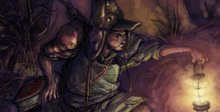
Still not entirely happy with sketch from last post. Spent a little time doing more workups, trying to find a better pose.


Biggest prob I had with the sketch in the last post: The one arm holding the lance - technically it felt correct, but silhouette-wise and pose-wise, it just wasn't sitting right for some reason.
I think a part of the prob was positioning portions of the armor in relation to the pose, esp. w/ the shoulder/arm areas. But for the most part, I think it was just the general angle, shape, and silhouette that was turning me off. Not exaggerated enough, not loose enough. I should just do the rubber hose thing with the arm and the whole body - one long bendy shape...
Which calls into question just what exactly am going for here, character design-wise?
Ugh.... But a good challenge.
......
Speaking of tackling challenges: A bit of Gordon Ramsey a'la Ch. 4's Kitchen Nightmares, one of the best shows out there. Did these while having it on in the bg:


And that seems to be his equation: Growing a pair = better restaurant. Somehow, that works even when the restaurant is run by an all-ladies cast.

10 comments:
Dude, love these sketches. I like the top one the most. Crazy man, love to see those variations, great work.
Thanks man. I still want to get as good with the signature-like flowing lines like you've got. Esp. w/ how you do folds in clothes and whatnot - it almost looks like cursive character. I need to pick your brain about what brush settings you use.
wow! what an incredible blog! I love your style!
Thanks; I really like your style too, and approach to character design.
Dude, very nice design on the samurais. I can tell they are wearing some seriously cool armor! Your characters have so much life and again very awesome energy. Great expressions as well. If i may pick your brain for just a tiny bit of information, how do you go about getting your lines down? I have quickly become a fan of your line work! :D
TH3DEN;
Thanks again for stopping by and for the kind words; much appreciated.
Line work? Just fast and loose. Sometimes I'll doodle around with a light undersketch, othertimes I'll commit with quick heavy lines. Depends on what I'm drawing I suppose; if it's exploratory, then the doodling; if it's familiar territory (like a character I've drawn a bunch of times) then probably the harder linework, esp. if it's a pose, angle, or facial expression I'm comfortable with.
Also depends on the size of the drawing: Smaller thumbnails tend to leave more room for exact, heavier quick lines; larger pieces (larger being relative to a sheet of 8.5 x 11) needing more of the quick light doodle to find sizes, shapes, etc. Larger than that however (like a canvas), then it's a mix of both: really broad quick lines w/ a China marker, ranging from heavy decisive lines to lighter, hectic "doodle" lines.
I know; great technical terminology.
One thing that helps me is knowing how I'm approaching a sketch: With an idea in mind? or as a freeform Rorschach test? (meaning: let the lines do the walking and you'll eventually see the image therein after awhile.)
Either one has its advantages. Sometimes the Rorschach lets you have the leeway in screwing around with a pencil til an idea pops into your head. ("Hey, that reminds me of... etc.", "Ah, the character can be doing *this*..."). But for the most part, having an idea ahead of time (situation, characters, type of mood/attitude the character's in) is always good.
...Ok, this is getting wordy. Anyhow, hope that's along the lines of what you were looking for. Cheers.
:D that actually was very informative! thanks a bunch. its a very solid approach and actually i should consider being a bit more loose! Thanks again!
No prob; glad that I could be of service.
Armor is always a challenge. Most armor, in reality, impedes a certain range of motion which makes it really hard to draw correctly. Based on the actual composition, I think the second drawing is the best of the set.
Nice Ramsey drawings. I think it is amazing how on every show the restaurant is inches from the axe, until 10 minutes before the show ends, when there a split second saving moment. Then everything is hunkie-dory.
Thank you for being one of the few people that makes well thought out comments on my blog. I appreciate the thoughts. Let me know if it is cool to add you as a link.
Josh;
Thanks man, much appreciated. Yeah, I've gotten other comments that pointed to the second one as their fave out of the batch. Maybe it's because it's character interaction going on?
Yup, armor is a pain at times. For me, the biggest trip up is that it's kind of in that in-between phase of being both prop and part of the character - more specifically part of his/her physique and design.
On the one hand, as a prop it's restricted to being stiff, subject moreso to the laws or proportion and perspective than, say, a rubbery character. But on the other hand... well, if it's the character, it's gotta be exaggerated or pushed to serve the overall silhouette value or pose.
...And, the whole consistency-with-design thing, with whatever design/look is established by the artist at the beginning of the story, the visual rules (Can props bend or be exaggerated? Can the character switch from ultra rendered to super simplified? Or is everything strictly unified to one est. look? etc).
Post a Comment