- Been trying to get away from linework on some pieces and just letting the color do the walking.
Which doesn't mean I didn't use an undersketch. Just that I didn't rely on it as the final product. Though I did rely on custom textured brushes for both sketch and color, despite my kvetching about it last post.

(As you can see, I had to tone down the shape dynamics on the forearm.)

- Did a whole series of workup sketches beforehand. These are pretty much sequential in the order I drew them in from top to bottom. I may have reused the BG a few times but otherwise the poses were all drawn from scratch each time, no underlayer draw overs. Not that this is that impressive (or the iterations above), but given technology allows folks to trace photos and CG models for their digital work, it's probably worth pointing out when something isn't cheated copied, or redrawn on trace paper or an overlay layer.
The latter two aren't cheating, but it sometimes feels like it hems in the drawing and compounds the drawing issues that led to a redraw in the first place. Just basing that on (too much) personal experience.
- Some more exploratory sketch pages:


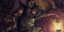
- And some more non-line finished pieces:


(One of the first attempts at trying this. This was before I realized how to reign in or group together properly color intensity.)


(The usual sketching around when I felt unsure about some of my drawing decisions beforehand.)
- Some linework and color getting together again:


- I did some sketches for another Draw This In Your Style over on Instagram. But I never got around to posting any of them for whatever reason. The reason being that I'm not all that happy with some of them. But, dirty laundry and all that. You have to air it out some time:


A few of the poses turned out alright. No photo reference for poses, never photo reference. Just so that I have a record somewhere of having said that.
Not that there's anything wrong with that. It's better than tracing.
This is also one reason why I've tried to switch over to traditional sketchbooks over the past few years. It never occurred to me that doing purely digital work raises that sus red flag for anyone that looks at your work, because... well, cheating tracing over photo reference is pretty ubiquitous online. There. F*ck it, I said it.
- Speaking of which, some random sketch pages. Mostly colerase in Rhodia sketchbooks, but there's one digital at the end: