
...So seems to be the case as of late. Anyhow, semi-monthly update.

 Some explanations for the drawings are in order: The several pages here are a continuation of the Chthulhu tank crew page I posted several months back. The blue pages are the most recent (last night); the others in red were back some months ago - the crimson was pretty much at the same time as the first page posted (somewhere below in another post); the scarlet were a few months after. In fact... quite a few of the things posted here have considerable gaps inbetween, some going back to almost a year ago. Hooray for procrastina... I mean, progress.

 If you pieced them together from oldest to newest, they'd be somewhat consistent as far as being sequential. As far as actual story... these are more screw-around pages, to keep my mind fresh with drawing something sequential. I think I spent more time trying to figure on how the steering mechanism operates the tank rather than where I was going with any of this.
Panels below are separate. Pen and ink somehow found their way onto the pages. Not entirely happy with every panel, but some of the individual character drawings turned out alright. The large panel that takes up half the page (right side) is an artifact of that screwing around I mentioned earlier. Find myself doing more and more of these - what are these called... friezes? - as of late. I blame Klimt.
 (There was a second page of ink. Will post another time.)
Some early sketches of these characters. Probably the 3rd pass, right after I did the initial two comic pages. You can see a gradual codification of the faces, esp. in comparison with the first comic page and character sketches (somewhere below in another post).
 Some more random sketches from some months ago.
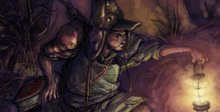
 I really like how this last one turned out for some reason. Maybe it's the environment being something more down to earth rather than sci-fi or abstract. Or maybe the shapes on the nurse. Definitely not the Grim Reaper lurking in the bg; no...
...........................
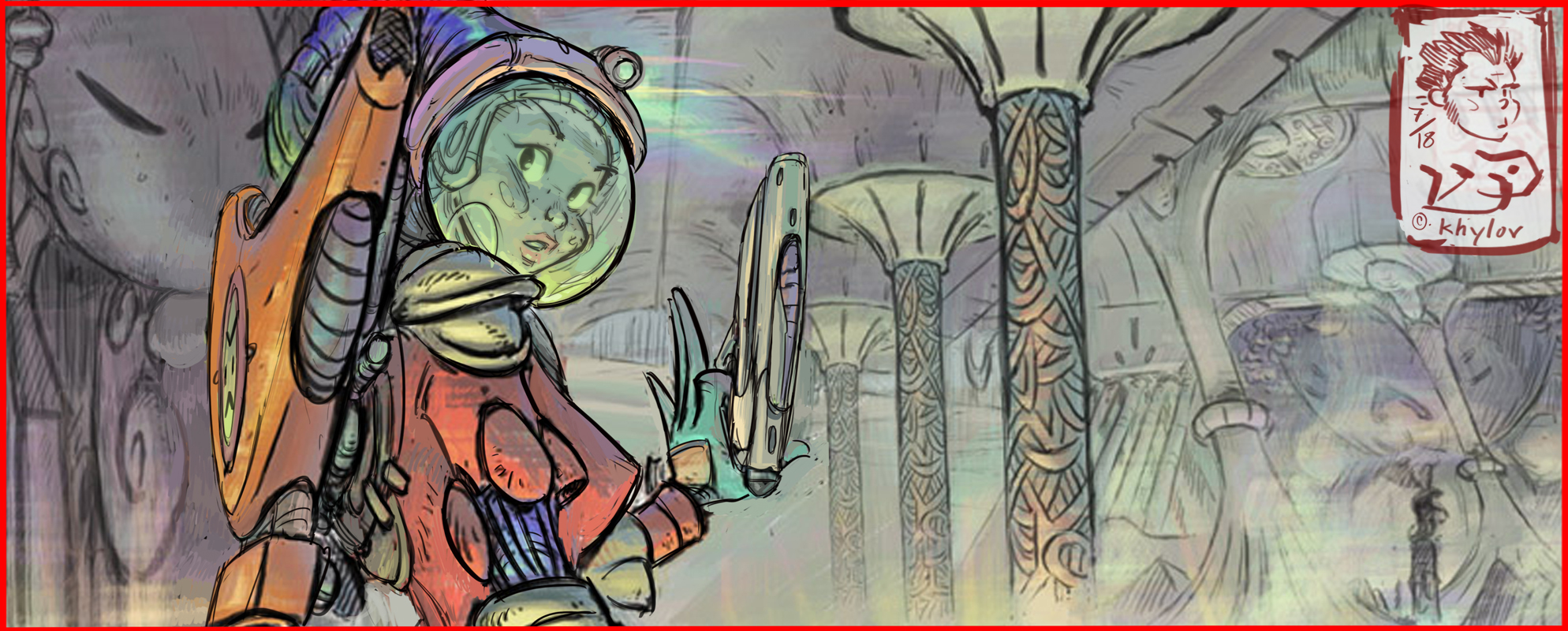
And as an aside, wanted to try to repost some of the color pieces I threw up (quite literally) back around November. Adjusted the saturation levels between the Cintiq and the monitor to compensate for how pastel the tones were looking on my computer back home. (These were done on another work station). Not sure how these'll fare out on most other monitors though:

Anyhow, some additional panels:

 Think the key is to punch the core tones and shadows to a nice level of vibrant, while wrangling in the light source tones (both primary and secondary) to a point where they remain both bright and vibrant - at the same time not being washed out, etc. Which is tough; you want those secondary light sources (or shaded areas) to not draw the eye away by being too saturated.
 In either case, I'm sure someone will comment on these being too dark. Which is probably correct, given that Wacom and Kinko's seem to have as a mission statement that no matter what I do, I have to constantly guess what the actual color I'm painting in looks like. To quote Robin Williams; "It's like hunting with Ray Charles."

3 comments:
Great stuff man.
Awesome update, Lazarus :)
Thank you much, sirs.
Post a Comment