

 The Gulag Archipelago, volumes 1 and 3. Did these last year after finding a couple of old used paperback versions of the above. Since the covers were coming undone, figured it'd be worthwhile to take a crack at some layout and make my own dust jackets.
Some more dime-store layout:
 The Brothers Karamzov. Probably would do the "Dostoyevsky" font differently now. More than halfway through reading at this point.
  Used the mysterious Flammarion woodcut and some Photoshop to make the cover of Thomas Aquinas' Summa Theologica. The fonts were straight from the book binding. Could've finessed them a bit more.
On the shelf. The Chaos Space Marines tend to hang out next to the books (left and right).

9 comments:
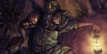
Powerful and mature style. Can you combine the style of Japanese author, with the drama of European artists like Enki Bilal.
Bravo!
That's awesome dude. So when can I pick up the books?
I like the book designs. I do some of that kind of work myself in the professional world.
Very nice work.
Now...can we get a close-up on the Chaos Space Marines to see how good your fine brushwork is? ;)
Sauro;
Thanks much, that's a high compliment. Alot of whatever I do is owed to Shirow. Looking at his latter comic work (Human Error Processor), he's got some European in the way he approaches rendering hands and certain character expressions.
Hwang;
Thanks man. You sure you want to read 1000+ pages of Russian lit though? Be warned: Have a bottle of vodka handy.
Josh;
Glad you like, and a bonus that I ventured into familiar territory your way. It's the proverbial cutting of the teeth for me, and I'd have to say that I'd dig on making a living from doing it if I can get proficient enough with fonts, color, and texture.
From what I've noticed at bookstores, just looking at what dust jacket designs catch my attention, it seems to be the rule of "smart use of minimal", even with all the possibilities that PS can offer for overly slick rave-postcard graphic effects. Depending on what kind of texture / material the jacket's made out of, bold and minimal still carries the day in most cases.
Don't think I kept faithful to that here, but I had those funky mid/late 60's Readers' Digest illustrations in mind when hitting these (esp. the Dostoyevsky bit).
John;
I had a feeling when I posted this entry that you'd hone in on the Space Marines, good sir.
For sure, I've wanted to post something on (as of now) 2 or so squads of Plague Marines, as well as some of the older Renegade models (Tzeentch, if I remember correctly), as soon as I can get my hands on a camera with a good macro lens. Right now I have a few pics, but out-of-focus enough to lose a bit of the detail. Might post them if I can't snap a few better ones over the week.
'Dug these bad boys up a while ago, and realized that besides being out of production, they're really well designed characters, even the first/second run Rogue Trader models. Been on the lookout for some of the other classic Chaos Marines ever since. I've been fortunate enough to find some used Death Guard models (circa '95) for sale at gaming / comic stores for 1 or 2 bucks a pop. Add that with some Milliput, and it's Hobbytown for me for several weeks on end. Good times.
yey! Good suff! ;)
( happy easter!)
^^
Hoorah, happy easter to you too, Manu. Was a good day of rain (mood and setting) and reading the gospel account (narrative and characters).
wow some of my favorite books there. haven't read aquinas though.
-Chris
Cool, thanks much man. The Aquinas book is almost like an instruction manual for philosophically constructing theology. Probably one of the first systematic presentations, before the term was applied to that field.
Post a Comment