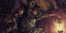
I know - I don't upload for over 2 months, and I pick today of all days to do it. Yeah, bad timing...
A quick sketch page with notes.

A couple of comic pages I did today - and dialog this time. Hoorah.


Alot of the erasing ended up leaving an accidental tone/shading of sorts - which kind of works at times. But I need to figure out a standardized way to do comic pages, something a little cleaner maybe - and more importantly something that will carry over into print without anything becoming lost in translation.
...Pen and inking is one method, but there are alot of drawbacks - one being a loss of the immediate line that you put down when you loosely sketch (i.e., you lose some of the life and energy of the drawing - or can potentially - when you nail it down with solid linework.)
I'll have to figure something out, to save my sanity if nothing else.
An older work-up sketch, from that box of sketches I keep talking about. (It exists, and it will be scanned at some point - trust me.)
 Foreground character should be resting his one foot on something in-frame - or be repositioned so that he looks more "on level" perspective-wise with the other characters.
Was based off another sketch that had more realistic rendering and proportions. Maybe that was part of the problem? - basing it on something without as much exaggeration? Problems, problems....
(There's a good reason why the lady's naked in the above sketch. Honestly. There's a whole sequence that revolves around that as a story point... of sorts. Stay tuned.)
............................
 And a little color, to upset my friends and family.
Alot of copy paper, alot of colerase, and a little PS cheating.


8 comments:
oh hey man! long time no see. what have you been up to? totally sweet blog, looks like you've been keeping busy. nice looking compositions all round.
Looks good man. I'm really diggin those little thumbnail drawings by the texts.
I too also put down alot of line when I draw. The great thing about working on the Wacom is that you can keep on erasing without killing the paper.
Looks very good. Please do not stop putting the comments in your updates!
Hwangnuguyen makes a good point - erasing digitally is the way to go. I have been having luck resizing drawings - printing them out light, and re-drawing the lines that I like and dropping the roughs with the levels tool.
Thanks for keeping a blog that is worth coming back to!
Bob;
Hey, good to hear from you again. I'm thinkin everyone made the exodus from 6 Point - where you at now?
BTW, the Kirby stuff looked great, both the character turn arounds and the short animation you had. Don't know if I left you a comment on that.
Hwang;
True that; Wacom is a friend for the sketch artist...
Wait... you been illustrating the stuff on your blog with a Wacom, or on a Cintiq? You realize of course that your kung fu skills will go up another level if you answer Wacom"...
David;
Ah, I see "anonymous" is no longer with us, eh? Cool cool.
Yup, I do the same thing with the saturation levels too. Except, it's usually to darken the scan after I get it into PS.
If the erase lines or smudges are too much for an area, I'll usually hit it with the clone tool - taking a part of the scan that's blank (since it's paper, and has tone/texture that matches the rest of the pic) and then going over the mistakes/smudges at about 60% opacity or more. Usually for clarity purposes only - some sketch lines get in the way, and you only see it after it's scanned and tone adjusted.
Nice thing about working in Photoshop and on a tablet/Cintiq is that you can have a layer purely for sketching, then a cleanup layer on top of that. ...I have yet to use that bit of advice meself, since I don't have the patience for digital cleanup on that level... But hey, once I kick the coffee/tea habit, I'm sure my nerves will settle enough for me to swim through a vat of molasses while erasing miles' worth of sketchlines. I do like the idea of trace-overs though.
Glad to see you're still alive! :>
-Roren
Christine;
Me too; I like breathing.
Glad to see you're still here too. Sounds like you've done well for yourself - good stuff, yo. I like the recent photo you uploaded - I still think my favorite is the farm at dawn. I drew an illustration with that as the bg.
Nice panels. I haven't visited for a while and I have only missed one post. The sketches are great and it is good to the colored version too. And I must add...every good comic at some point must tickle the male phylogeny by having a naked woman in print, so why not do it right off the bat.
Josh;
I agree, the female character nakedness had to happen at some point. Although, there really is a legitimate story reason as to why she's sportin no clothes in the middle of a prehistoric sausage party. With no sexual overtones at all, mind you. Maybe I'll upload that sequence next... Hmmm...
As far as tickling male phylogenies.... Ewww, man. That's just wrong.
Post a Comment