

So it's been awhile. In the meantime, I took a bit of a break from drawing digitally and focused on just busting out the sketchbooks and Colerase. I'll upload some of those soon enough.
For now though, I wanted to post what I did when I finally came back to the Cintiq and decided to approach some older pieces to revision. Some of these are from scratch, but most I did previously, whether a few months before or a few years, sometimes more. Stepping away from... well, not the comfort zone, but from one method of drawing... it really gave me fresh eyes to see what bad or weird habits I was getting into when drawing specific things like faces or whatever digitally.


And the latter from scratch, hopefully with some improvement. This was the last in this music rehearsal series. There were more images I redid, but there were the better of the lot.
------------------

I found the above as a rough undersketch I did a few years ago that I never got around to completing. Well, til now. So partially from scratch I guess.

I posted the first versions of these on here like 3 or more years ago, so go dig for those if you want to compare. One on the left was from scratch, one on the right were drawovers on the original image. I don't know if I got the quadruped run for a biped thing, but I definitely approached silhouetting the poses differently than before. That and the facial shapes, as always.
----------
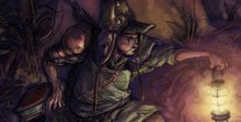
I went even further back and dug up some ugly ancient history from the
archives.


Even though I wanted to color the one and haven't finished it yet, I didn't want to rush over the drawing part just to get to the eye candy phase. Which is what I did with the originals.
As always, these are benchmarks to see how or where exactly I needed to improve, or where hopefully I have already. As far as color... Eh, I think I'm more efficient with my choices now and maybe more knowledgable, but the general palette still feels a bit the same. Not as heavy on the darks. Coloring's not as much the focus anymore, for good or for ill.
Truth be told, I don't want to hide behind colors or the patented custom grainy brush doing either flowy Glen Keane / Milt Kahl chinamarker line weight, or late 2000's Pixar portfolio quadruple sketch lines that have those nice little strategic gaps. That all looks good, and there's a time and place for that. And maybe I'm just too dumb to know how to use stylistic digital cheats in the main linework to give it that extra industry edge. But apart from a quick tone wash or dot matrix texture, I want to rely on as few bells and whistles in the drawing itself as possible. I want to keep it as close to the same fundamental choices I'd make if it were just pencil and paper. (And part of that has been keeping the brush size small and at 60 - 70% opacity, rather than the larger brush pen thing I used to do at 80 - 100% opacity several years ago.)
------------------
More random pieces that didn't escape the revisioning:


No comments:
Post a Comment