
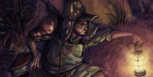
As per usual, I post something that I'm not happy with 5 minutes later. So, another handful of hair pulled and yet another redraw - on one single piece of paper this time:

And some attempt to make amends for my lack of proper shape and silhouette last post:


I realized that - other than using two pieces of paper taped together, and not drawing fluidly or quickly enough - I hit the first Soldat illustration right after I had read some dated obituaries for Hunter Thompson. I figure that one (or several) of the images from the article - consciously or otherwise - stuck in my head when I started drawing; hence another awesome excuse for why the pose came out the way it did.

.....
Speaking of which: Something cool I noticed while browsing through my laptop archive of pictures - every so often there'd be a random pairing of images together, one after the other, that would look pretty cool: They'd either mirror-image eachother in some way (faces, elements, pose, theme), or else they'd be complete contradictions. Fairly random placing to boot...Sound boring and convoluted? You bet it is! Here are some examples:
-Akashi Gidayu writing his death poem just before committing seppuku... and Hunter Thompson.

-Operation Ivy (S.F.) and The Faith (D.C.), one apparently channeling the energy of the other.

-Because Ukrainian car models and English punks... tend to be white. And like to pose.

-I'll venture a guess the Google search that day was for something blue.

-About as opposite as you can get. War and Peace, anybody?

-Ok, so these two images weren't exactly side by side - but I couldn't resist. Bill Shatner shamelessly doing a plug for Commodore "computer-and-game" system, and a Soviet poster - which (I think) reads: "With Capitalism: Millions of unemployed workers".


6 comments:
Awesome, man. The greatest poses certainly come from life and the observation thereof!
Great pictures, too. I love the odd relationships between the pairings.
Just because I comment on one aspect doesn't mean I'm ignoring the others and I just wanted to throw in my two cents.
The redraw is alot better bro. The two key things that make it better is the sash and feet. They both help pull the perspective off much better than the previous drawing. Nice extra touches were how wide his body is now, the detail on the sword hilt, his hat and his hand on the book. Everything flows so much better this time around. Weird how the eyes pick up on things that we're not even aware of sometimes that turn the image from an "ah" to an "eh".
Sorry that my responses haven't been as on-the-ball as before, folks. But thanks much the same for the comments and observations.
Austin, thanks much - I have to admit though that the trappings of armor and war gear go a long way for making illustrations more fun. And yup, the paired pictures: I was tempted to tag folks to do this over the next week on their own blogs.
Red White; very true - it's the little things that can really pull an illo to the next level. Albeit, my main gripe was and is my posing - which in this case, is all about hitting it without any concern for details. I forgot my cardinal rule: Draw quick and sloppy, and keep the details for later. I tend to forget this time and again, and I pay for it. Oi.
Thanks much for the commentary.
Wow, this is amazing work! Very inspiring. As a graduating art student, I was wondering if you can check out my blog and tell me what you think,it would be great.thanks
Hey Kyle. I like the redraw, its a much stronger silhouette despite the small changes. :D And as always i love your colors. Really great stuff man! How`s progress on the comic going?
Hey TH3DEN and Edgar;
Thanks again for the comments and stopping by. (Good to see you again, btw, TH3DEN). Don't have much time to comment or browse, and I apologize for that. In time, I'll give a whirl by your sites and check out the digs. Thanks much, folks.
Post a Comment